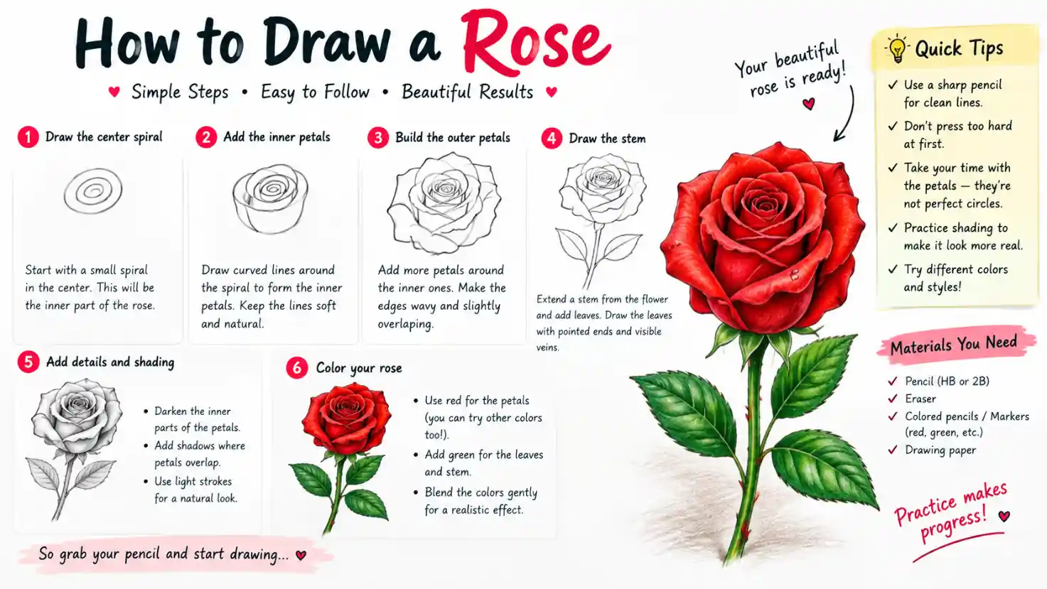
Few flowers capture the eye quite like a rose. With its spiraling center, layered petals, and graceful curves, it’s a favorite subject for artists of every skill level but it’s also one of the most intimidating flowers to draw. The overlapping petals can look complex at first glance, tempting many beginners to give up before they even start.
The truth is, learning how to draw a rose becomes far easier once you break it down into simple, repeatable shapes. Instead of trying to capture every petal perfectly, you’ll learn to build the flower in layers: starting with a basic spiral, then adding petals outward until the full bloom takes shape.
If you’re sketching a quick doodle in your notebook, working on a realistic botanical study, or designing rose line art for a tattoo, this guide walks you through every stage from your first pencil marks to shading and finishing touches.
Understanding Rose Anatomy (Before You Draw)
Before picking up your pencil, it helps to understand what you’re actually looking at. A rose isn’t just a random cluster of petals; it follows a predictable structure, and knowing this structure is what separates a flat, stiff sketch from one that looks alive.
At the center of every rose is a tight spiral, where the newest, smallest petals curl inward around each other. This is the “heart” of the flower and usually the best place to start your drawing. Moving outward, petals gradually get larger and looser, unfurling away from the center in overlapping layers rather than sitting side by side.
Petal shape matters too. Rather than flat ovals, rose petals are typically cupped, slightly ruffled, or folded at the edges; this is what gives the flower its soft, dimensional look. Some petals curl outward at the tip, others fold inward, and no two are perfectly identical.
Below the petals, you’ll find the small, leaf-like segments that cradle the base of the flower where it meets the stem. Further down the stem, leaves grow in small clusters (often three or five per group), with jagged edges and a visible center vein. Thorns are scattered irregularly along the stem, not evenly spaced.
Finally, consider your viewing angle. A front-facing rose shows the full spiral and symmetrical petal layers, a side view emphasizes the curve of the stem and profile of the bloom, and a 3/4 view the most commonly drawn blends both for a natural, dynamic look.
Tools and Materials
You don’t need an expensive art kit to draw a beautiful rose; a few basic supplies are enough to get started, though the right tools can make the process smoother.
Pencils are your most important tool. An HB pencil works well for initial sketching since it’s light and easy to erase, while a 2B or 4B pencil is better for darker outlines and shading once you’re happy with your shapes. If you plan to shade extensively, having a small range of pencils (from 2H to 6B) gives you more control over light and dark values.
Paper matters more than beginners often realize. Standard sketch paper is fine for practice, but if you intend to add heavy shading or ink work, a slightly heavier paper (like bristol board) prevents smudging and holds up better to erasing.
Erasers are essential, not just for fixing mistakes. A kneaded eraser is especially useful for lifting graphite gently to create soft highlights on petals, while a standard vinyl eraser works for cleaning up guidelines.
Beyond the basics, a few optional tools can elevate your drawing:
- Fine-liner pens for clean, permanent linework once your pencil sketch is finalized
- Blending stumps or tissue for smooth graphite shading
- Colored pencils or watercolors if you want to take your rose beyond black-and-white
- A reference photo or real flower invaluable for realistic roses, since it shows exactly how petals overlap and catch light
Start simple. As your confidence grows, you can experiment with additional materials and techniques.
Method 1: The Simple/Beginner Rose (Stylized)
If you’re brand new to drawing or just want a quick, recognizable rose for a doodle, greeting card, or journal page, this stylized method is the perfect place to start. It skips detailed shading and realistic petal structure in favor of clean, simple lines while still capturing the essence of a rose.
Begin by drawing a small spiral in the center of your page, similar to a snail shell shape. This spiral doesn’t need to be perfect; a slightly imperfect, hand-drawn look actually adds charm.
From the outer edge of the spiral, draw a curved line that loops outward and back in, like a wave, then continue this looping motion around the spiral two or three more times, each loop slightly larger than the last. Think of it as wrapping a ribbon loosely around the center point.
Once you’ve built up two or three wrapping layers, close off the bottom of the flower with a simple curved base, then add a stem extending downward. A couple of quick leaf shapes with pointed ovals with a center line complete the look.
This swirl technique is popular because it requires no erasing, no complex layering, and can be drawn in under a minute once practiced. It’s especially useful for:
- Bullet journaling and planner decoration
- Quick greeting card illustrations
- Logo or icon design
- Warm-up sketches before attempting a more detailed rose
Don’t worry about symmetry here; the charm of this style comes from its loose, organic feel.
Method 2: The Classic Layered-Petal Rose (Most Common Tutorial Style)
This is the method most people picture when they think of “how to draw a rose” a fuller, more structured flower built from individual petal shapes rather than a single continuous swirl. It takes a bit more patience than the stylized version but produces a far more convincing result.
Start with a light guideline: a rough circle or oval to mark the overall size of the bloom. In the very center, draw a small tight spiral or a tiny “C” shape that represents the innermost, still-curled petals.
Next, surround that center with a ring of small curved shapes, each resembling a rounded “U” or cupped triangle. These inner petals should hug closely to the center and slightly overlap one another, as if wrapping around the bud.
Working outward, add a second ring of petals, larger than the first. Vary their angles slightly so they don’t look mechanically repeated, some tilt left, some right, some appear to fold over at the top edge.
Finally, add the outermost petals, the largest in the flower. These often curl outward or droop slightly downward, giving the rose its open, blooming appearance. Three to five outer petals is usually enough.
Once your petal layers are in place, erase the original guideline circle and refine the overlaps, making sure each petal’s edge tucks behind the one in front of it. This overlapping detail is what sells the illusion of a real, three-dimensional flower rather than a flat pattern.
Method 3: The Realistic Rose
Once you’re comfortable with basic petal structure, drawing a realistic rose is about shifting from “shapes you know” to “shapes you actually observe.” This method relies on close observation rather than a fixed formula, which is why working from a reference photo or a real flower makes a significant difference.
Start by studying your reference carefully before drawing anything. Notice how the petals aren’t uniform, some are wide and open, others are tightly curled, and many overlap in irregular, asymmetrical ways. Rather than forcing petals into neat rings like in Method 2, let their placement follow what you actually see.
Block in the overall silhouette of the rose lightly, then work from the center outward, drawing each petal’s unique contour, including any folds, tears, or slight imperfections in the edges. These small irregularities are what make a rose look believable rather than stylized.
Pay close attention to your light source. Identify where light hits the flower directly, where it falls into shadow, and where petals cast subtle shadows onto each other. This is the foundation for shading, which you’ll build on in the next section.
Edge variation is also key to realism: petal edges closest to the light or camera tend to look sharper, while edges in shadow or turning away from view often appear softer or slightly blurred. Capturing this contrast between crisp and soft edges adds depth and helps the rose feel three-dimensional rather than flat.
Drawing the Stem, Leaves, and Thorns
A rose isn’t complete without its stem and foliage, and getting these right adds just as much life to your drawing as the bloom itself.
The stem should rarely be perfectly straight. Real rose stems have a slight, natural curve, often bending gently toward the direction the flower is facing. Draw it with two parallel lines rather than a single stroke, giving it a small amount of visible thickness rather than a flat wire-like appearance.
Leaves typically grow in small clusters along the stem, most commonly in groups of three or five. Each leaf follows a pointed oval shape, wider in the middle and tapering to a tip. Add a visible center vein running the length of the leaf, with smaller vein lines branching diagonally outward from it. The edges of rose leaves are slightly serrated, so use short, jagged strokes rather than a smooth outline to capture this texture.
When placing leaf clusters, vary their angle and size slightly, leaves higher on the stem tend to be smaller, while those lower down are often larger and more open.
Thorns add a finishing realistic touch. Rather than spacing them evenly, scatter a few small, curved triangular shapes irregularly along the stem, pointing slightly downward. A handful of thorns is usually enough; overcrowding the stem can make the drawing look cluttered rather than natural.
Together, a gently curved stem, textured leaves, and a few well-placed thorns help ground the rose and make the whole composition feel balanced and alive.
Adding Depth: Shading and Texture
Shading is what transforms a flat outline into a rose that looks like it has real volume and softness. Once your linework is finished, this stage brings the drawing to life.
Start by identifying your light source and imagine where light is hitting the flower from, since this determines where highlights and shadows fall. Petals facing the light stay lighter, while petals angled away or tucked beneath others fall into shadow.
Cross-hatching and blending are the two most common shading techniques. Cross-hatching uses layered sets of fine parallel lines to build up darker values gradually, giving the rose a slightly textured, hand-drawn feel. Blending, done with a blending stump, tissue, or even a fingertip, smooths graphite into soft gradients, better suited for a realistic, almost photographic look.
Pay special attention to the folds between petals; this is where the darkest shadows usually sit, sometimes called the “core shadow.” These deep creases are essential for making petals look like they’re truly overlapping rather than simply drawn on top of one another.
To capture the delicate, slightly translucent quality of rose petals, keep some areas very lightly shaded, especially near petal edges where light can pass through thin material. Leaving small, crisp highlights areas with no shading at all on the curled tips of petals suggests a soft sheen and adds a sense of freshness to the bloom.
Take your time with this stage. Shading gradually, in light layers, gives you far more control than trying to darken an area all at once.
Common Mistakes and How to Fix Them
Even with a solid method, a few common pitfalls can make a rose drawing look stiff or unconvincing. Here’s what to watch for.
Overly symmetrical, flat-looking roses. Beginners often try to make every petal identical in size and perfectly mirrored on both sides. Real roses are naturally imperfect petals that vary in size, angle, and curl. Fix this by intentionally varying petal shapes and letting a few tilt or fold differently than the rest.
Petals that look disconnected rather than overlapping. If your petals resemble separate puzzle pieces instead of a flowing bloom, the issue is usually a lack of overlap. Make sure each petal’s base tucks slightly behind the petal in front of it, and let some petal edges cross over one another rather than sitting neatly side by side.
Stiff, perfectly straight stems. A rigid, ruler-straight stem instantly makes a drawing feel unnatural. Add a gentle curve, even a subtle one, to suggest the stem’s real weight and flexibility.
Overworking the center. It’s tempting to keep adding detail to the spiral core, but too many tight lines can make the center look muddy or overly busy. Keep the innermost spiral simple and let the surrounding petal layers carry most of the visual interest.
Uniform, evenly spaced thorns. Perfectly spaced thorns look artificial. Scatter them irregularly, with varying sizes, for a more natural stem.
Recognizing these issues early and revisiting earlier sections if needed will noticeably improve the believability of your rose.
Style Variations
Once you’ve mastered the core technique, you can adapt your rose drawing into several distinct styles, each suited to different purposes and aesthetics.
Line-art / tattoo style. This style strips away shading entirely, relying on bold, confident outlines and varying line weight to suggest depth. Thicker lines are typically used for outer contours and shadowed folds, while thinner lines define inner petal details. This style is popular for tattoo flash designs, minimalist wall art, and logo work.
Watercolor rose. For a softer, more painterly look, begin with a light pencil sketch as your guide, then build up the rose using layered watercolor washes rather than heavy line work. Petals are often left with soft, blended edges, and white space is used strategically to suggest highlights instead of erasing.
Digital drawing considerations. If you’re working digitally, brush choice matters significantly. A textured pencil or ink brush works well for the initial sketch, while soft round brushes on low opacity are ideal for shading. Using separate layers for line art, base color, and shading gives you far more flexibility to adjust values without redrawing.
Minimalist / single-line rose. This continuous-line technique draws the entire rose spiral center, petals, and stem without lifting the pen. It requires more planning than other styles but results in an elegant, modern illustration often used in branding, tattoos, or simple decorative art.
Experimenting with these variations helps you develop a personal style while reinforcing the underlying structure you learned in earlier sections.
Practice Exercises
Like any skill, drawing a convincing rose improves with repetition. These focused exercises help you build muscle memory and confidence before tackling a full, finished piece.
Spiral drills. Set aside a page and draw nothing but small spirals, over and over, focusing on smooth, controlled curves. This is the foundation of every rose center, so getting comfortable with this single shape pays off across every method.
Petal-shape drills. Fill another page with individual petal shapes cupped, folded, pointed, and rounded variations. Practicing these in isolation makes it much easier to place them confidently once you’re building a full flower.
Copying from photos. Choose a handful of rose reference photos, ideally from different angles, and practice replicating their petal structure and shading as closely as possible. This trains your eye to notice details you might otherwise overlook, like irregular overlaps or subtle shadow patterns.
Drawing from imagination. After practicing from references, try sketching a rose entirely from memory. This reveals which parts of the structure you’ve internalized and which still need more observation-based practice.
Timed sketching challenges. Set a timer for 5 or 10 minutes and draw as many quick, loose roses as you can in that window. This builds speed and spontaneity, loosening up any overly careful or stiff linework that can come from slow, deliberate practice.
Rotating through these exercises regularly, even for just 10–15 minutes a day, will noticeably improve your control and confidence over time.
Tips for Improvement
As you continue practicing, a few habits can accelerate your progress far more than simply drawing more roses on repeat.
Study real roses whenever possible. Photos are useful, but observing an actual flower in person or even a high-quality video reveals details that photos can flatten out, like how petals shift and catch light as the flower moves or as you change your viewing angle. If you have access to a garden or a grocery store bouquet, take a few minutes to really look before you draw.
Build a “shape library.” Keep a dedicated sketchbook page (or several) filled with different petal shapes, curls, and folds you’ve drawn or observed. Over time, this becomes a personal reference you can pull from when you want to add variety to a new rose without starting from scratch each time.
Be patient with layering. Realistic-looking roses are rarely achieved with a single confident pass. Build up your petals, shading, and details in light layers, stepping back periodically to assess the whole flower rather than getting lost in one small section.
Don’t rush the center. The spiral core sets the tone for the entire flower’s proportions and rhythm. Take extra care here, even if it means slowing down, since mistakes in the center are harder to correct later without disrupting the surrounding petals.
Track your progress. Save your practice sketches, even rough ones, and revisit them after a few weeks. Seeing tangible improvement is one of the best motivators for continued practice.
Conclusion
Drawing a rose might seem like a daunting task at first, but as you’ve seen throughout this guide, it becomes far more manageable once you break it down into its core elements: the spiral center, layered petals, stem, leaves, and thorns. If you started with the simple swirl method or jumped straight into a realistic, shaded piece, the underlying structure remains the same and that structure is now something you understand from the inside out.
Progress in drawing rarely happens overnight. The difference between a stiff, uncertain first attempt and a confident, lifelike rose usually comes down to repetition: practicing the spiral, experimenting with petal shapes, studying real references, and gradually layering in shading and texture. Each sketch, even an imperfect one, builds the visual memory and hand control that make the next attempt a little easier.

I am Stephen King an American writer exploring spirituality, dreams, mindfulness, and personal growth. Through SpiritualDreamz.com, he shares thoughtful insights to inspire reflection, clarity, and meaningful everyday living.